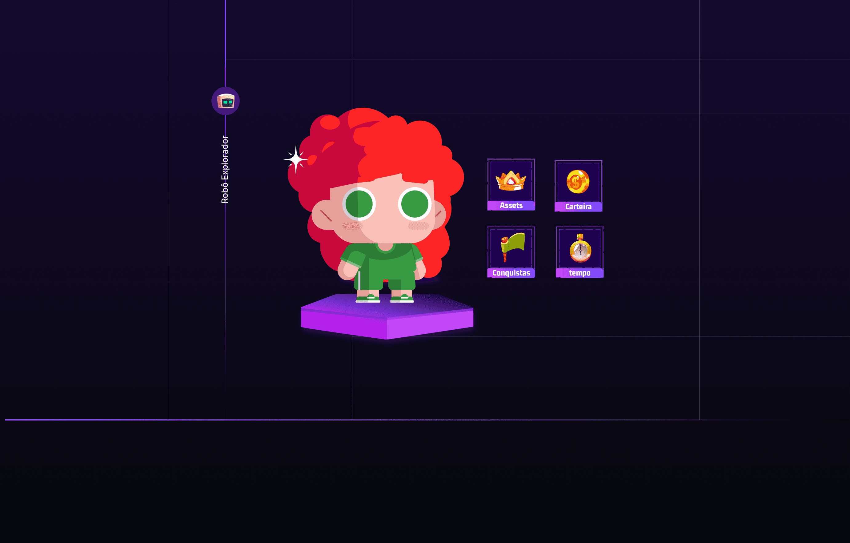
To make the game more effective and enjoyable for kids, I introduced an onboarding process that provides clear instructions on how to start and play. This was crucial because, without it, children were unsure about where to begin and how to interact with the game. I redesigned the visual identity to incorporate both modern 2D and 3D elements, which was a key request from stakeholders.
This update made the game look exciting and consistent, so kids would find it both engaging and easy to navigate.
I also prioritized making the game more accessible and user-friendly by improving the overall interface.
Through extensive testing with children, I was able to refine the UI and gameplay. This iterative process helped ensure that the game was not only fun but also easy for kids to understand and engage with. The goal was to provide an intuitive and immersive experience that encourages learning and exploration.

